Tim Stanislav.Web Development & Automation

Work

Case studies

Both of these are demo builds for fictional businesses. I made them to show how I approach a site, using the same process I would use for yours: start with what that kind of business needs, decide what the page has to do, and only then design it.

Demo build · Lawn and tree care · Five pages

Kestrel Lawn & Tree Co.

What does a lawn care site need to do when the customer is standing in their own yard?
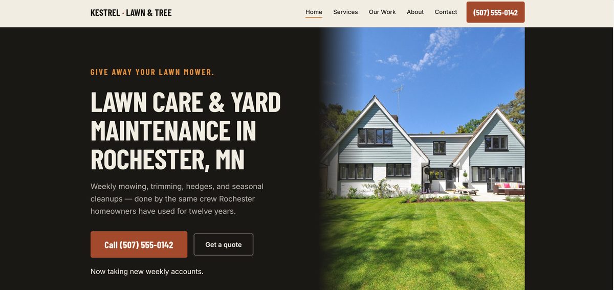
Desktop homepage of the Kestrel Lawn and Tree Co. demo site: a striped lawn in front of a house, the headline Lawn Care and Yard Maintenance in Rochester MN, and a tap-to-call button.
  • BusinessFictional lawn and tree care company in Rochester
  • PagesHome, Services, Our Work, About, Contact
  • PhotosLicensed stock, since a demo has no real crew. A client site would use your own.
  • TypeBarlow Condensed for headings, Inter for text
  • SpeedAbove 90 on Google's mobile audit

The brief

A lawn and tree business sells something people judge by looking: a mown lawn, a cleared bed, a tree that no longer leans over the garage.

The brief I wrote for it assumed the customer is a homeowner comparing two or three local crews, often on a phone and often from the yard itself. The site's job is to make calling this one feel like the obvious next step.

The decisions

  • The phone number is never more than a thumb away. It sits in the header on every page, and on a phone it stays in a bar fixed to the bottom of the screen while you scroll.
  • Before-and-after photos get their own section. The change in a yard is the strongest argument a crew has, so it appears on the home page and leads the gallery.
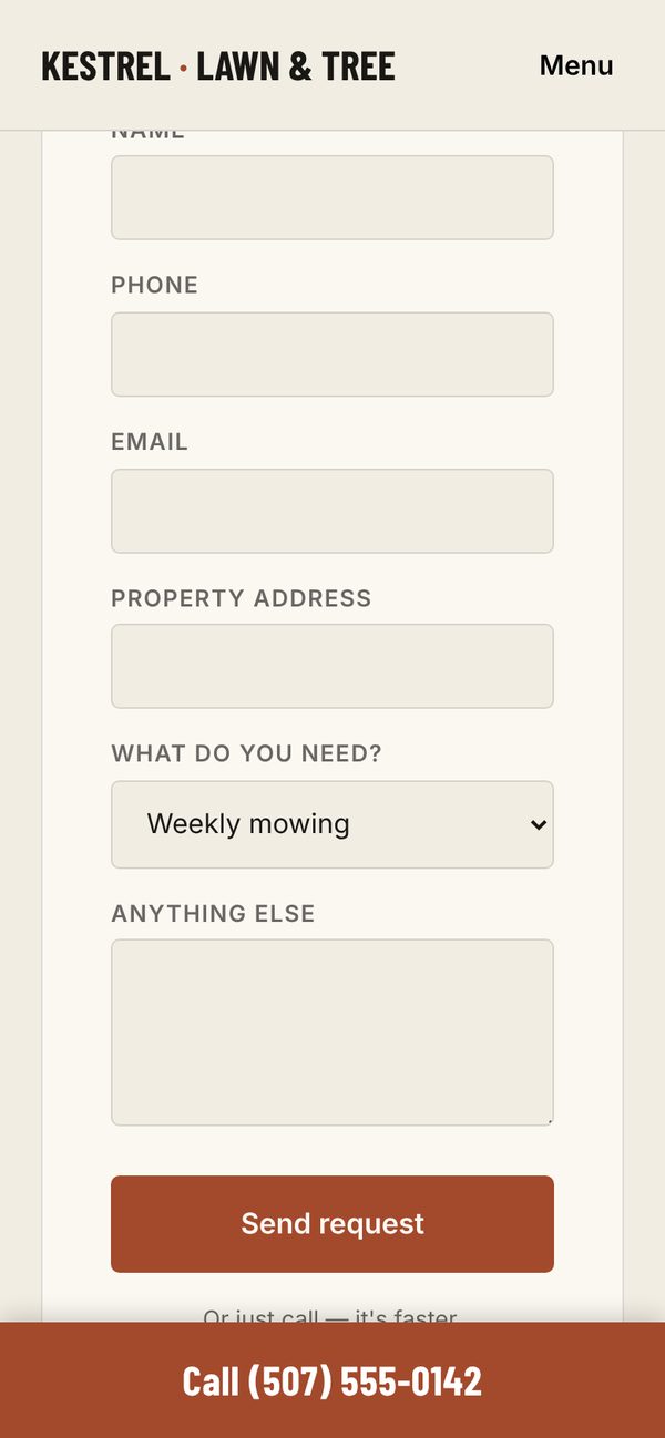
  • The quote form asks what the owner needs to price the job. The type of work, from weekly mowing to tree removal, and the property address. The contact page also offers to take a photo of the yard by text, for people who would rather not type.
  • The services page says what the company doesn't do. That keeps the calls that come in to the jobs the crew wants.
  • The colors come from the bird it is named after. Rust from the kestrel's back, slate from its wings and a pale buff from its underside, with condensed capitals for headings that read clearly at a glance.

How it was planned

Before designing anything, I looked at how established lawn care sites in larger markets order their pages and where they put the phone number, and I took those decisions rather than their look. The colors, type and wording are Kestrel's own.

On a phone

This is where a lawn care site gets judged, so most of the decisions above are about it. The first screen is the headline and a photo of the work, with the call bar fixed underneath, and the quote form is a single column of large fields that are easy to fill in with a thumb.

Open the Kestrel site ↗
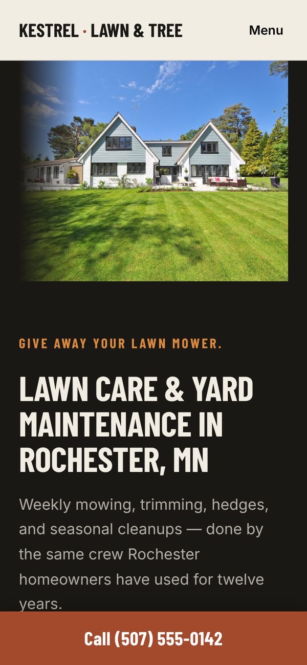
Kestrel home page on a phone, with the headline and a call bar fixed to the bottom of the screen.
The first screen on a phone. The call bar stays at the bottom as you scroll.
Kestrel quote form on a phone, asking for name, phone, email, property address and the type of work needed.
The quote form asks for the property and the type of work, so the job can be priced before the call back.

Demo build · Coffee bar · One page

Ardwyn Coffee Co.

What does someone need from a cafe's website when they are deciding where to get coffee in the next ten minutes?

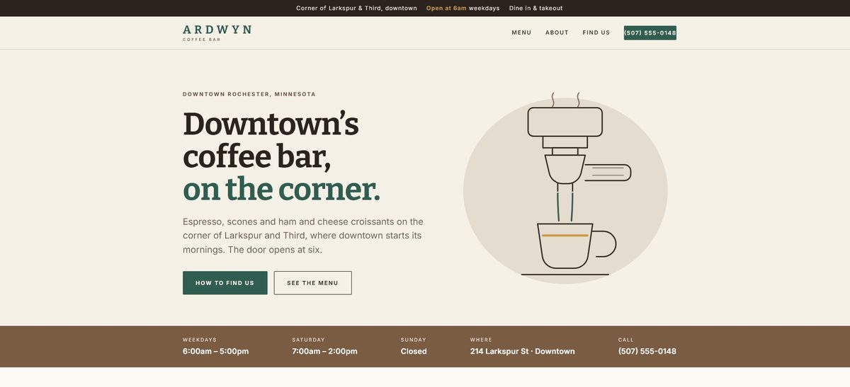
Desktop homepage of the Ardwyn Coffee Co. demo site: a line drawing of an espresso machine pouring into a cup, the headline Downtown's coffee bar on the corner, and a strip with hours and address.
  • BusinessFictional downtown coffee bar
  • PagesOne, with sections for the menu, the shop and directions
  • ImagesOne original line drawing, drawn in code
  • SizeThe page is a single file of about 22 KB
  • SpeedAbove 90 on Google's mobile audit

The brief

A cafe's website is read in a hurry, and the questions are nearly always the same: is it open, where exactly is it, and what do they have.

Everything that slows down those three answers costs a customer, so the page is built to answer them in that order, before it says anything about the shop itself.

The decisions

  • Opening time first. A bar at the very top says what time the door opens and which corner it's on, and the full hours and address sit directly under the headline.
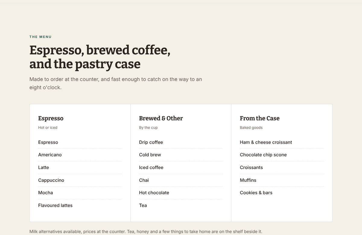
  • The menu is grouped the way the counter is. Espresso, brewed and other drinks, and the pastry case. It lists what they make without prices, which change more often than a website gets updated, so prices stay at the counter.
  • Directions are written the way a regular would give them. Look for the green awning, the counter is straight ahead, and there is a small lot behind the building off the alley.
  • A drawing instead of photographs. One original line drawing, written directly into the page, gives the shop a character of its own without stock photos of someone else's coffee, and adds nothing extra to download.
  • Sample content is labelled as sample content. The business is fictional, so its reviews are marked as samples on the page rather than passed off as real ones.

The result

One page that answers the three questions on the first screen of a phone, in a single file of about 22 KB with no photographs to load.

Ardwyn menu section: three columns headed Espresso, Brewed and Other, and From the Case, listing drinks and pastries without prices.
The menu, grouped the way the counter is, with prices left at the counter.
Open the Ardwyn site ↗
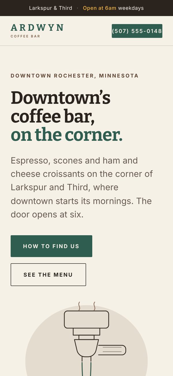
Ardwyn home page on a phone, with the opening time and corner in a bar at the top, the headline, and buttons for directions and the menu.
On a phone, the opening time and the corner are the first thing on the screen.

Your business

Want to see how this would work for yours?

Tell me what the business does and what isn't working now. A first conversation takes about fifteen minutes.